Four floral designers give us their take on this season’s designs
INGRID CASSON
Bold Colour
For Jaco Jooste-Kramer and his team at Casa dei Fiori in Pretoria, colour is one of the key inspirations when it comes to flower design. “Forget posies with lots of gip, upright triangular arrangements and bunches of flowers in cello sleeves. “Colour is a big trend right now. Any colour can be put with any other colour and carnations in particular are available in the most wonderful hues. Don’t be afraid to be bold. Also, try grouping flowers and textures for visual impact and make use of
unusual containers,” says Jaco. “Often my designs start with a particular flower, colour or foliage type. I prefer the flowers to speak for themselves. Colour was my big inspiration for this hand-tied bouquet, then combining it with texture and foliage so that the flowers are the focus of the design.”
Casa dei Fiori, Waterkloof Heights, Pretoria, 012-346-3014, www.casadeifiori.com
Simple Indulgence
Franz Grabe says simplicity and indulgence are the two parallel creative lines at Franz Grabe Flower Couture in Parktown North. “I am just a little bit closer to simplicity at the moment and I think it still offers an impact of richness,” explains Franz. He says a hot trend on the floral design scene is to re-invent old fashioned and “stigmatised” flowers. “We have seen anthuriums, proteas and pincushions go this route and at the moment it’s happening to gip, dahlias and carnations.” In the not hot category, Franz says this applies to single gerberas in clear glass containers, and red and white mixed flowers. “If you must use red and white together, keep like colours grouped and not mixed.”
Franz Grabe Flower Couture, Parktown North, Johannesburg, 011-022-3894, www.franzgrabe.co.za
Erotic Beauty
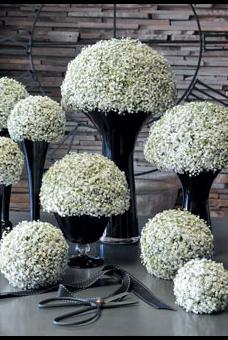
Colin Shandoss of Atomic Orchid loves working with flowers because they are the sex organs of plants and are, by their nature, erotic just by being themselves. “This is seldom conveyed with their use in design when we usually bestow unnecessarily sentimental values to their symbolic meaning and cultural connotations. At Atomic Orchid we always strive to let the erotic and natural beauty of flowers simply be.
There is a constant yearning to allow the flowers to express their natural tendencies with as little human interference as possible,” says Colin. “The composition we created here was inspired by the colour white, which to me represents summer, simplicity and progress. As much as I am drawn to vivid, eye-popping colour, I do feel that all-white compositions radiate supreme elegance and quiet excitement. For instance, we rarely mix white with another colour, apart from green. Only a highly skilled master colourist has the restraint and the flair to work colour into a white palette and white into a coloured palette.”
Atomic Orchid, Milpark, Johannesburg, 011-782-3715, www.atomicorchid.co.za
Classy Glass
Katja Kellhofer of Gloss Concept Floral Couture believes that simple designs, classic looks and lots of colour will always be in fashion. She believes that the use of green plastic containers and clear glass is more forward thinking and classic than the traditional “choir” arrangement in a triangle shape. “There is so much more to design than that old boring look.”
Katja’s design was inspired by her Victorian home, atriums, Charles Darwin, and growing plants from bulbs in season. In terms of design trends, she has observed a lot of indigenous plant matter being used indoors, dried thorns used as decor and the abundance of anything in mass is always in fashion.
Gloss Concept Floral Couture, Johannesburg, 083-740-0594, www.gloss-floral.synthasite.com
Shot on location (and all props from) Garden Bleu garden furniture and decor in Johannesburg, Pretoria and Riebeek Kasteel, www.gardenbleu.co.za
SOURCES
ANDREA CALDWELL

